Safar
Safar is a travel planning app that empowers users to customize trips, offering budget-friendly accommodation, transport, and activities for a seamless travel experience.


Project type
Course Project
My Role
UX / UI Designer
Duration
12 weeks
Tools
Figma, Canva
*To facilitate the user experience, I have emboldened the "how" (methodology), and highlighted the "why" (reasoning / goal).
The Problem
Travelers struggle with complex booking processes and finding affordable, customized trip options within their budget.
The Solution
Safar simplifies trip planning by offering personalized, budget-conscious recommendations for accommodation, transport, and activities.
User Research + Pain Points
In the Safar, I focused on budget-conscious individuals who seek affordable and convenient travel options. The primary user group includes working adults and families with limited time to plan their trips.
The research revealed key pain points, such as navigating complex booking processes and finding cost-effective travel solutions, guiding the app’s design toward simplicity and user-friendliness.


The research collected previously helped create user personas, which would be used later to lay the groundwork for the iterative process and help inform design decisions.
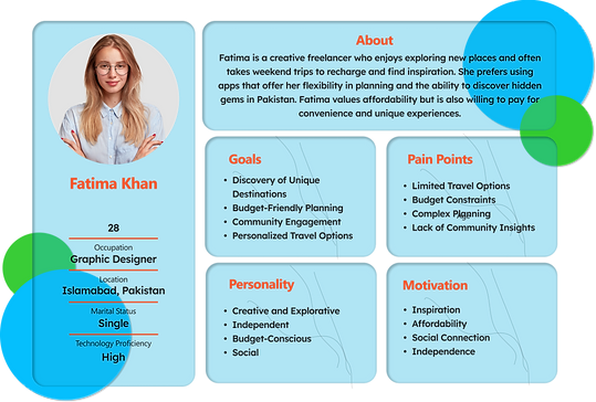
User Personas

User Journey Map
By analyzing the personas and considering how the app may be used, I created a user journey map. This was done to see the improvement opportunities, as well as adding a unique value proposition.

Problem Statement + Ideation
The work done previously to empathize with the user helped to define the problem and come up with a problem statement for our persona;
'Ali needs a simple and affordable way to plan trips that fits his budget because he wants to explore new places without overspending or compromising on preferences.'
For ideation, I used the "How might we" method to brainstorm ideas quickly for possible solutions to common user problems. The following questions were formed:
How might we
-
Offer personalized trip recommendations within a budget?
-
Simplify trip planning while offering complete options like transport and accommodation?
-
Ensure real-time pricing and availability updates for users?
Usabilty Studies

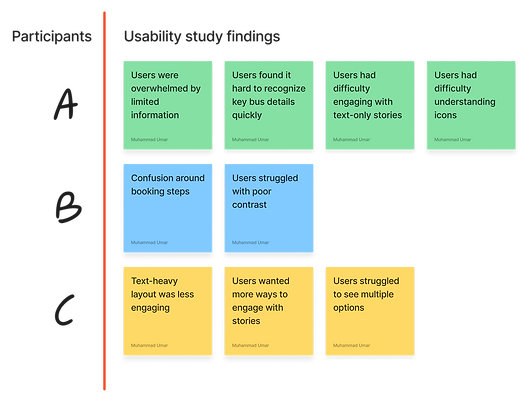
After the high-fidelity prototype was made, I conducted the first round of testing through unmoderated usability studies with 5 participants.
The findings from this research would then help to make iterations based on feedback.
Wireframes

Lo-fi Mockups and prototyping


Design Itrations

New Screen
New Screen
New Screen
Users struggled with poor contrast, now text and visuals are more accessible.
Text-heavy layout was less engaging, images add context and increase interaction.
Users had difficulty understanding icons, now they are clearer and clear navigation.
When converting wireframe screens to digital mockups, I used Gestalt Principles to make the app easier to understand and navigate.
Following the design, I turned the wireframes into a lo-fi prototype to conduct user testing and bring the final result closer.
You can view the prototype here.
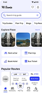
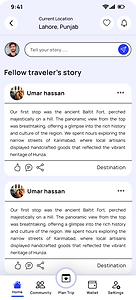
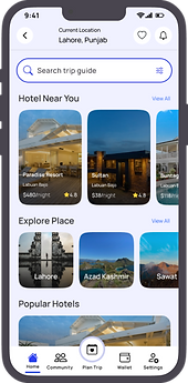
Final mock-ups


Clickable prototype
The clickable prototype has been provided here for an understanding of the app navigation;
-
The app here is just a demo version, so it has a few sample screens, and not all the buttons can be clicked.
-
Click on the blue highlighted regions if you are unsure what to select.
-
The screen can be enlarged by pressing on the full-screen icon at the top right corner of the prototype.
Accessibility Considerations
-
Consistent visual hierarchy enhances scannability, guiding users to essential content quickly and efficiently.
-
High contrast between text and background ensures readability, adhering to the principle of visual clarity.
-
Large, tappable buttons improve touchpoint accuracy, enhancing usability for diverse user needs and devices.
-
Simplified navigation follows the 'Recognition Over Recall' principle, reducing cognitive load for all users.